Cantina Dei Secoli
The Problem
Every wine brand tells the same story: sun, soil, family, vineyard. The visual language is interchangeable. Rolling hills, script type, gold foil, a founder pointing at a hill. When every bottle romanticises the same origin, nothing stands out. Cantina dei Secoli needed an identity that broke from this entirely without losing legacy credibility.
The Approach
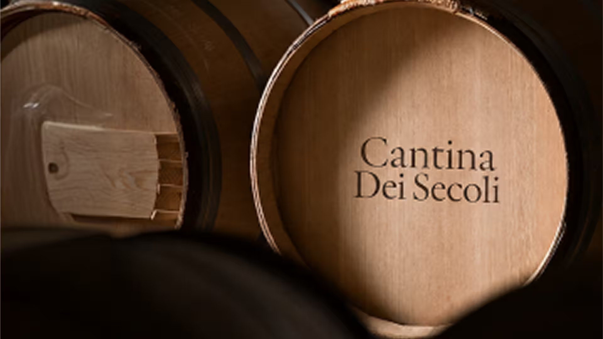
We built the brand on one pillar, the cellar, and excluded everything above ground. No vineyard, no landscape, no daylight. Every decision filtered through one question: does this exist inside the room? The palette comes from oak, stone, and candlelight. The illustrations are etched in a single brown ink.
The label is shaped like a vaulted arch. Bottlings are named for barrel numbers and vault rooms, never vineyards. The brand speaks the way a cellarmaster speaks: few words, unhurried.
The Outcome
A complete identity system that lives entirely underground. Label, packaging, brand cards, coasters, social media, and a verbal language that's ownable across every touchpoint. The stamp-arch label and barrel-head motif create instant shelf recognition.
The copy system, from "Invecchiato nel Silenzio" to "Buio, legno, tempo," gives the brand a voice no competitor can borrow. Cantina dei Secoli doesn't compete with other wine brands. It starts a different conversation. In the dark, on its own terms.