.avif)
.avif)
Rive
The Problem
Rive wanted to build a fashion brand that felt rooted and familiar, yet visually distinct from the wave of hyper-polished, repetitive D2C grids. The challenge was to create something old-school in spirit but still relevant and catchy, without leaning into nostalgia that felt dated or disconnected from the present.
The brand needed a visual identity that stood apart from trend-led fashion feeds, while still feeling intentional, elevated, and recognisable across platforms.
Our Approach
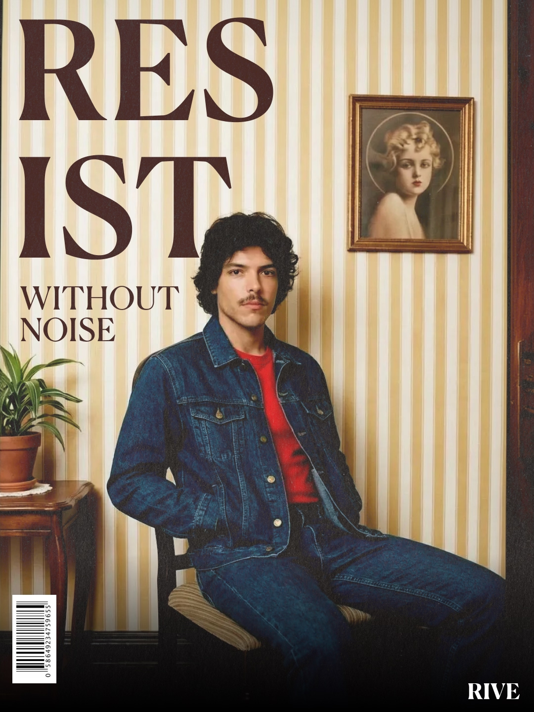
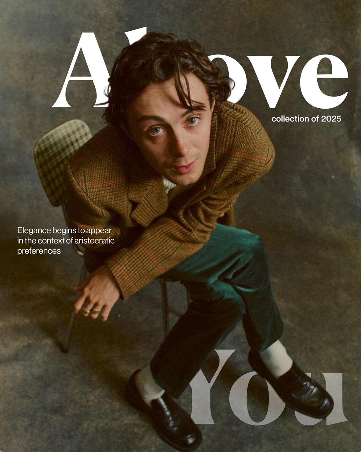
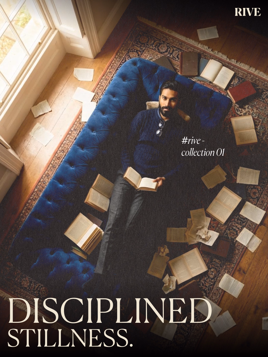
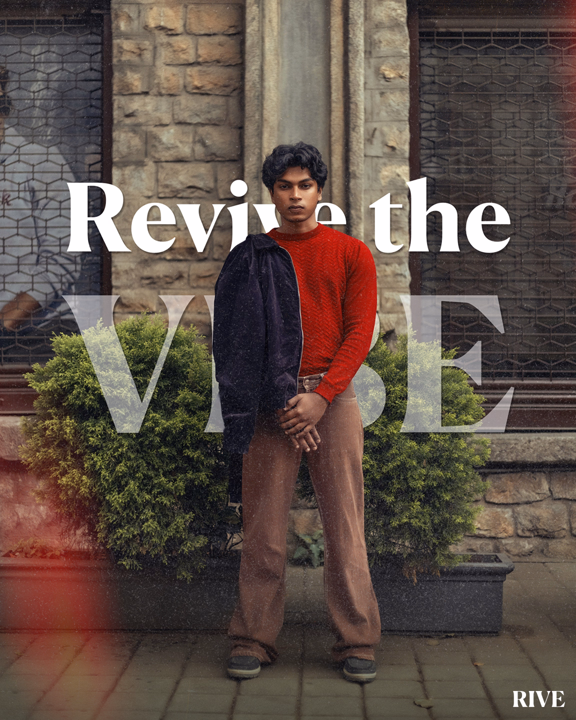
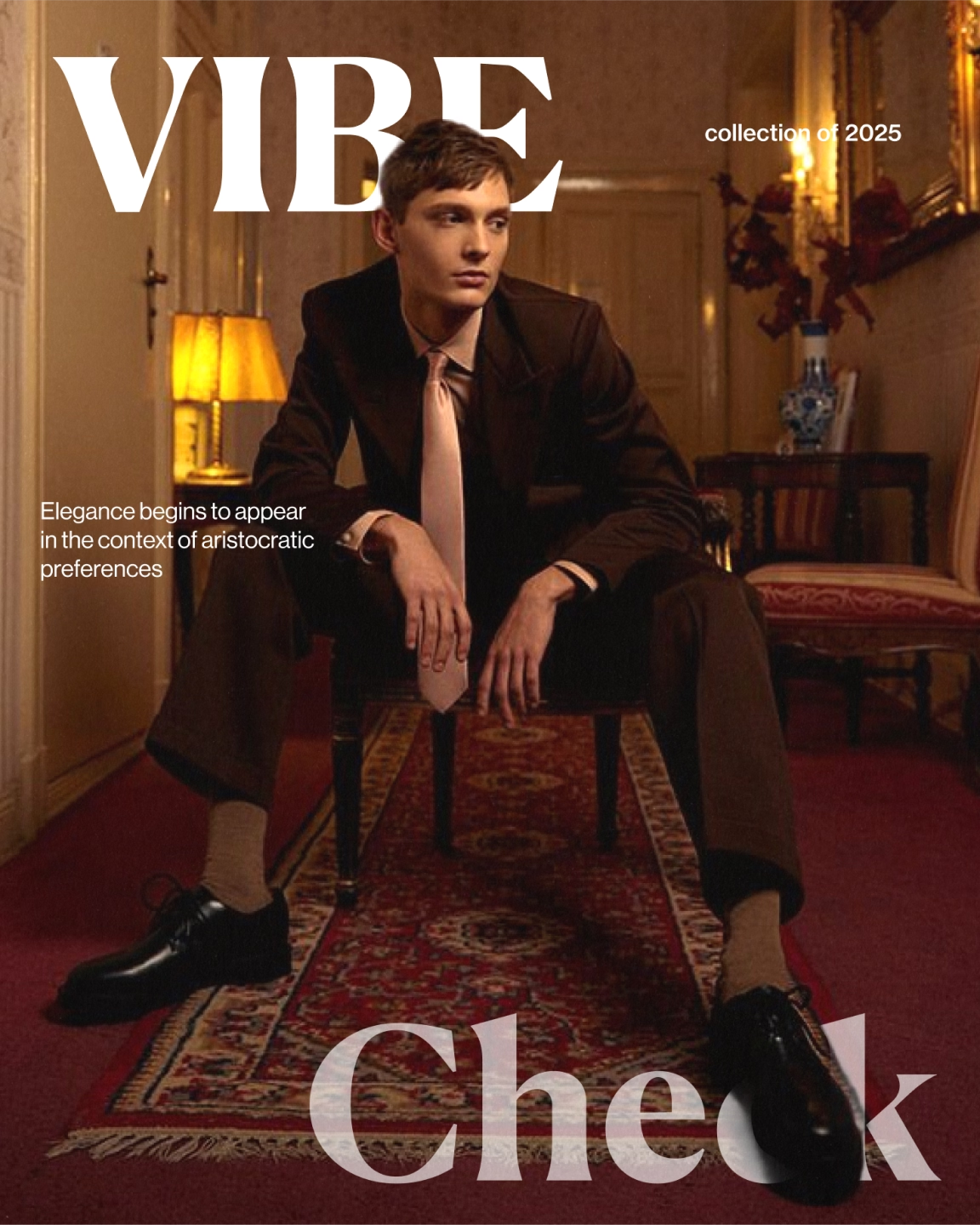
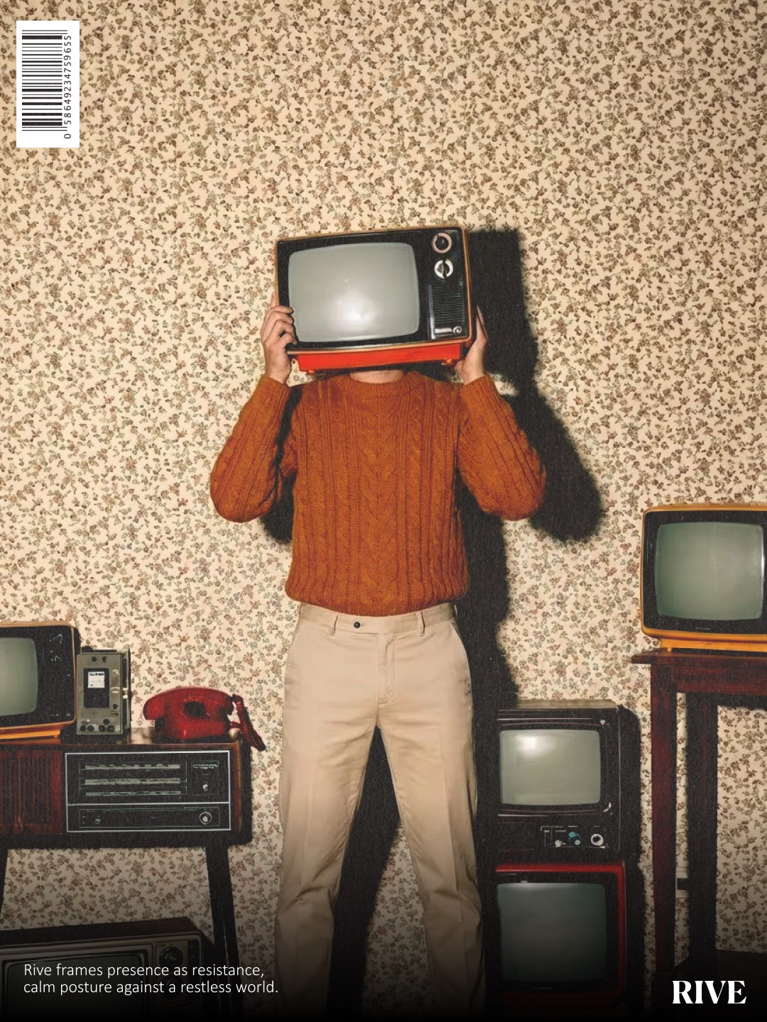
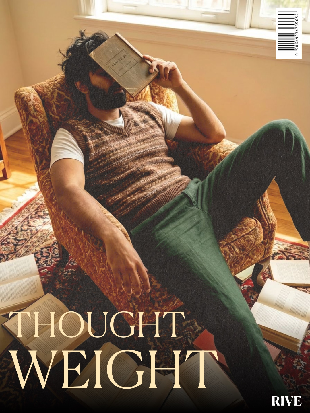
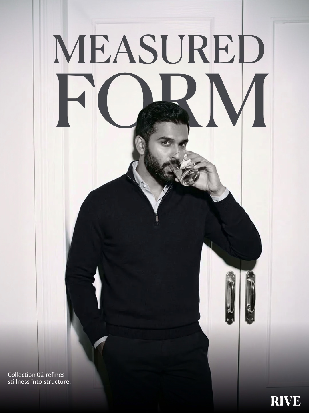
We positioned Rive as a brand that draws from editorial culture rather than e-commerce aesthetics. Instead of following standard D2C layouts, we built the visual direction around magazine-style compositions, inspired by classic editorial covers and vintage print design.
This approach allowed the brand to feel curated and expressive. Strong typography, considered layouts, and restrained colour palettes created a sense of timelessness, while modern styling and sharp art direction kept the identity fresh and contemporary. The result was a system that felt collectible rather than transactional, encouraging viewers to engage with the brand visually, not just shop it.
The Outcome
Rive emerged with a distinct visual language that feels confident, memorable, and refreshingly different. The editorial-led identity gave the brand depth and personality, setting it apart from conventional D2C fashion brands and positioning it as culturally aware rather than trend-dependent.
The final direction offers Rive a flexible yet recognisable framework, allowing the brand to evolve while maintaining a strong, cohesive presence across platforms.
Visual Identity
Logo
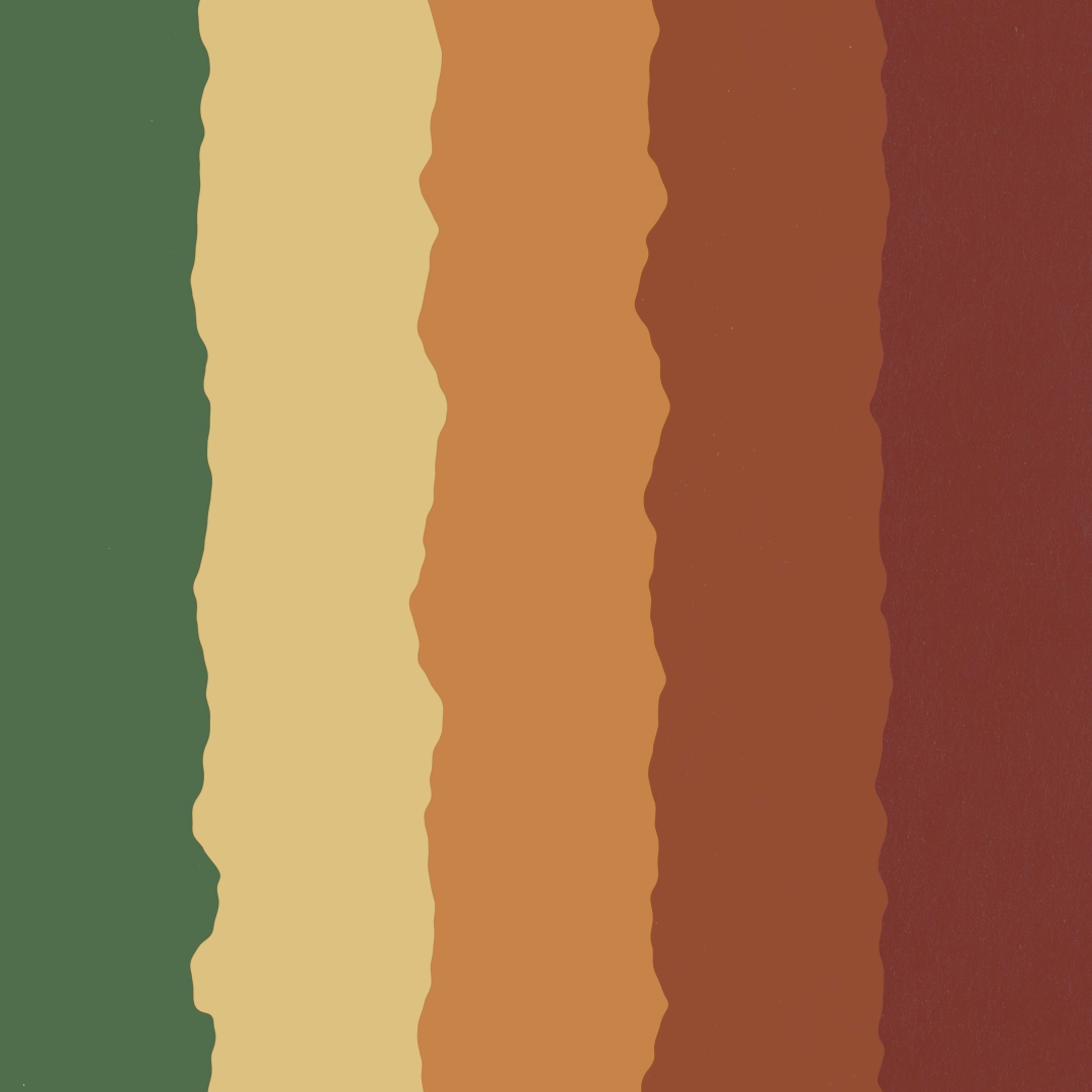
Color Pallet
Post 1
Post 2
Post 3
Post 4
Post 5
Post 6
Post 7