Taraash
The Problem
Taraash is the modern jewellery line of an Indian, family-owned legacy brand looking to build a strong online presence and prepare for a future D2C journey. The challenge was to introduce a contemporary identity without losing the cultural depth, craftsmanship, and trust associated with a generational business.
The brand needed to appeal to a younger, digitally native audience while still feeling rooted, refined, and respectful of its heritage.
Our Approach
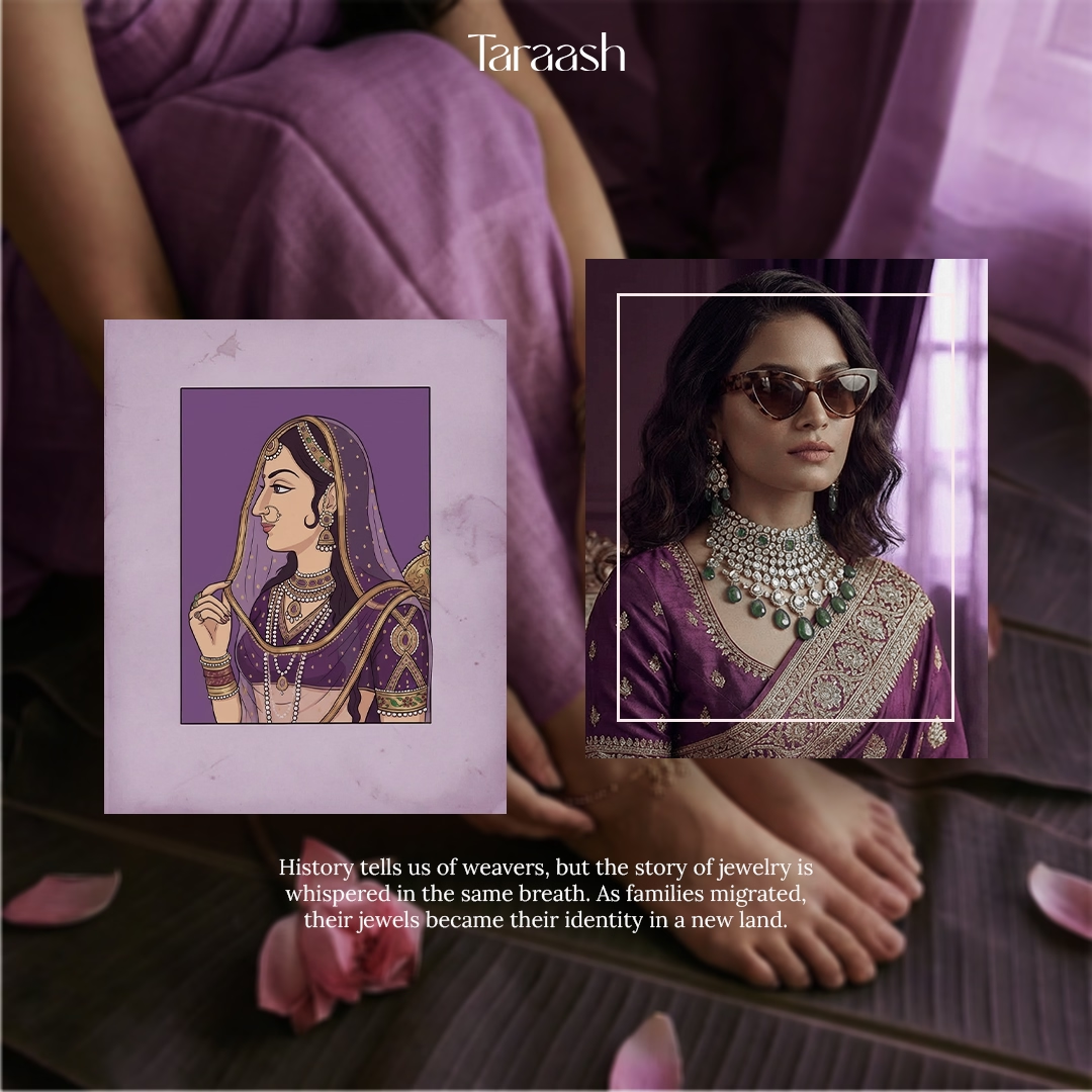
We positioned Taraash as a bridge between tradition and modernity. The visual identity was designed with a contemporary lens using a soft yet distinctive colour palette that feels current, elevated, and platform-ready. Typography and layout choices were clean and intentional, allowing the brand to sit comfortably in a modern digital space without feeling generic.
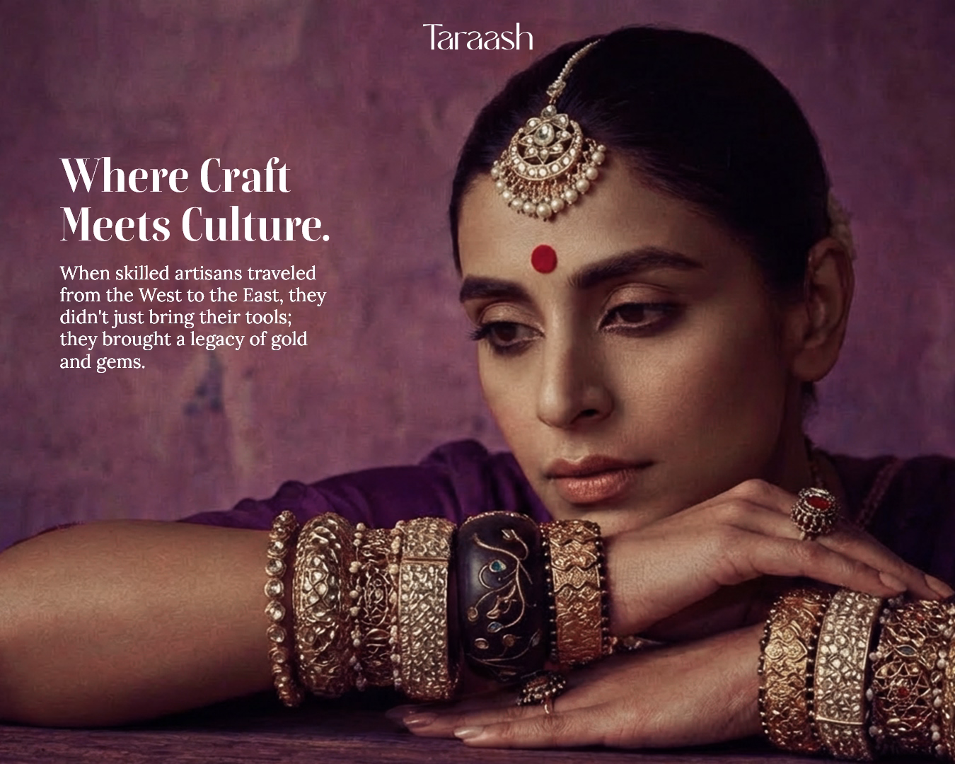
At the same time, the photography direction stayed closely aligned with the parent family-run business. Styling, lighting, and compositions were grounded in cultural authenticity, craftsmanship, and emotion. This ensured the brand felt modern in its expression, but familiar in its soul, creating continuity rather than disruption.
The Outcome
Taraash emerged with a refined, future-ready identity that feels confident, contemporary, and culturally anchored. The brand now has a clear visual system built for online storytelling and eventual D2C growth, while still carrying the credibility and warmth of its legacy. The result is a jewellery brand that feels aspirational without being distant, modern without losing meaning, and ready to evolve across digital platforms.
Visual Identity
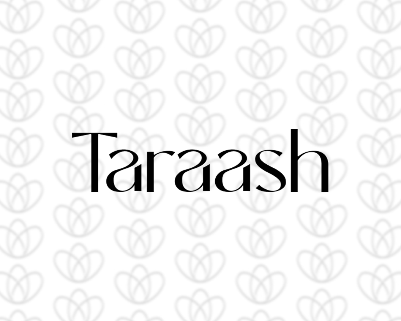
Logo & Covers
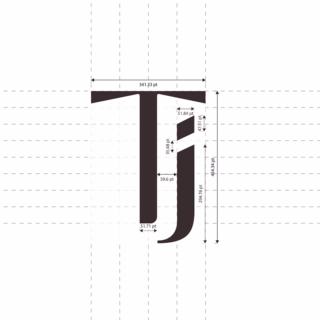
Logo Construct
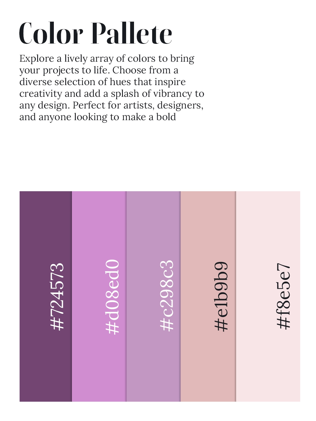
Color Pallete
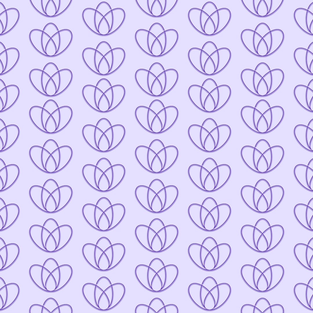
Pattern
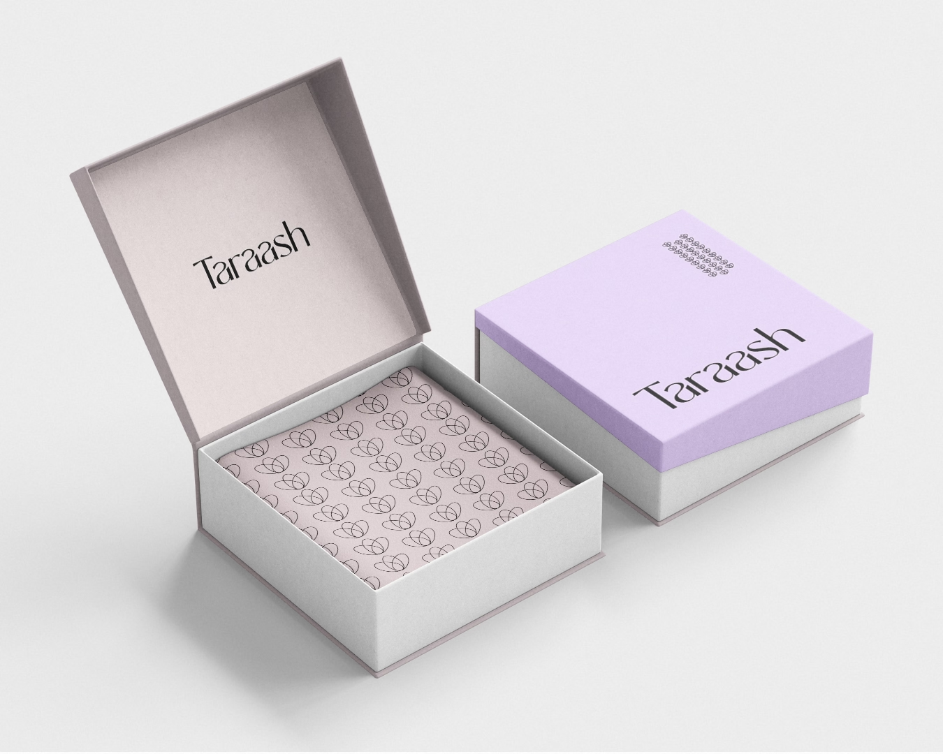
Packaging
Post3
Post 2