To&Fro
The Problem
To&Fro entered a saturated Indian menswear category where most online stores read the same — same hero carousel, same product grid, same trust-badge footer. The brand needed a storefront that looked premium without performing it, distinct enough to register on first scroll, and built to convert without flattening the identity into another fast-fashion tab. Three pressures, usually at odds, had to hold at once.
The Approach
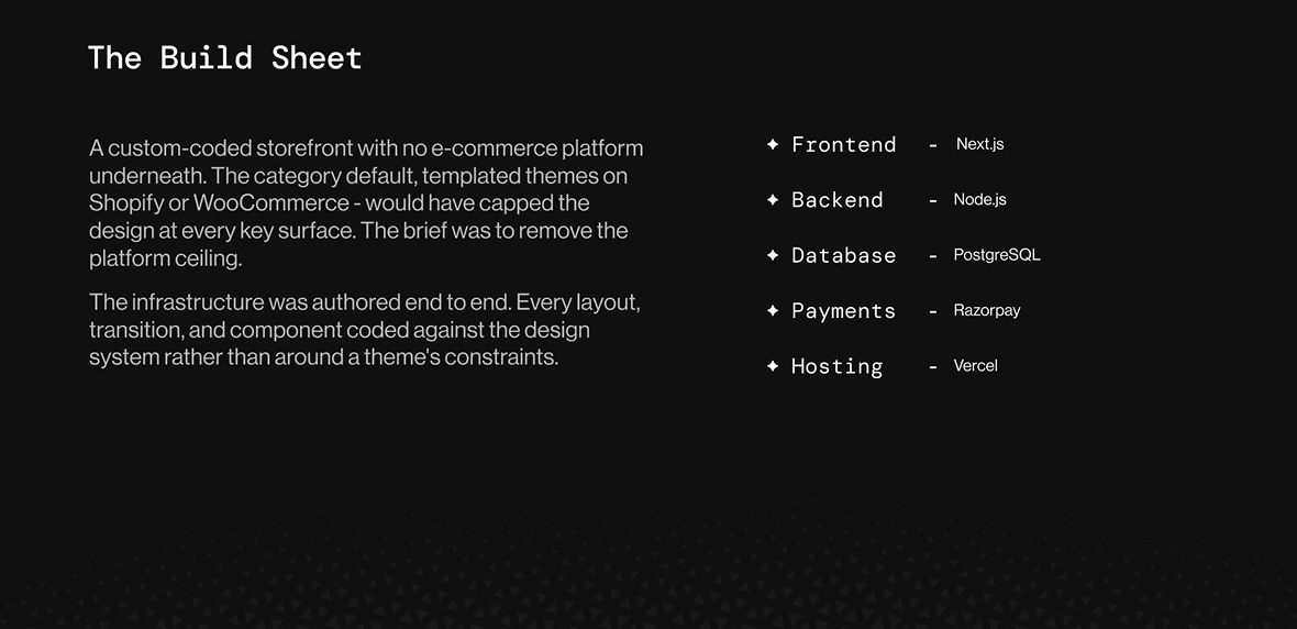
Platform builds were ruled out early. Templated systems would have capped the design. We built ground-up as a custom-coded application, every layout and component authored against the design system, not configured around a theme.
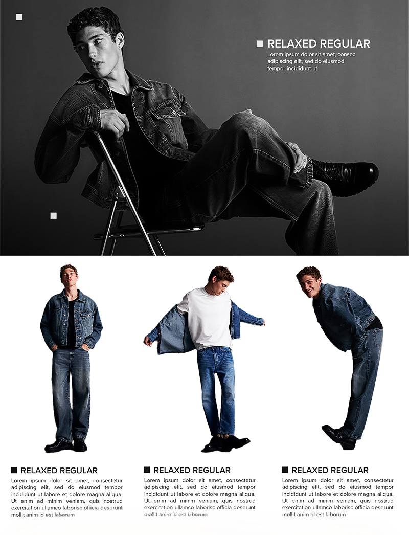
The interface was treated as an editorial surface that happens to sell. Black-and-white photography as the spine. Generous space, minimal chrome, editorial images inserted between product rows so even the flattest page reads composed. The conversion layer kept frictionless underneath.
The Outcome
A storefront that ships with a fully resolved e-commerce system — front to back, design system to deployment. Reads premium without performing it. Converts without flattening. A custom-coded codebase free of platform constraints, ready to scale as the brand grows.
Storefront
Product Grid
View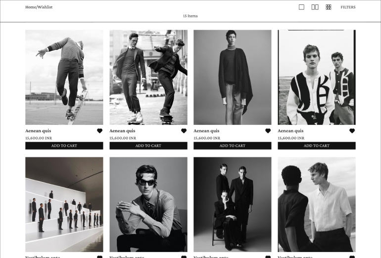
Collection Listing
View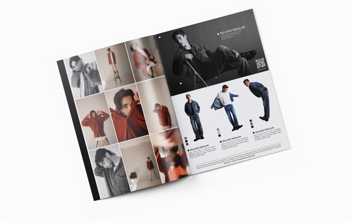
Lookbook
View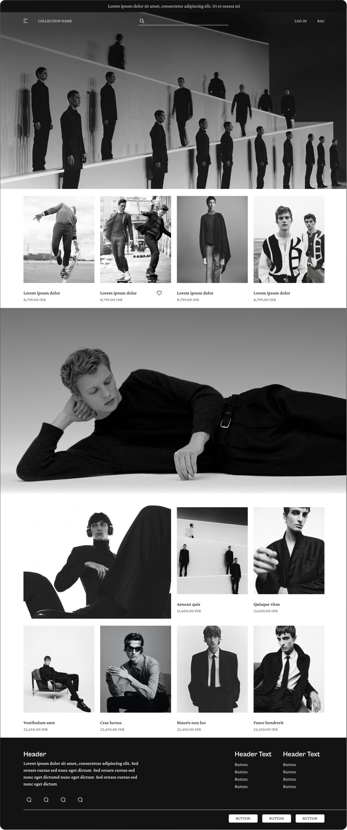
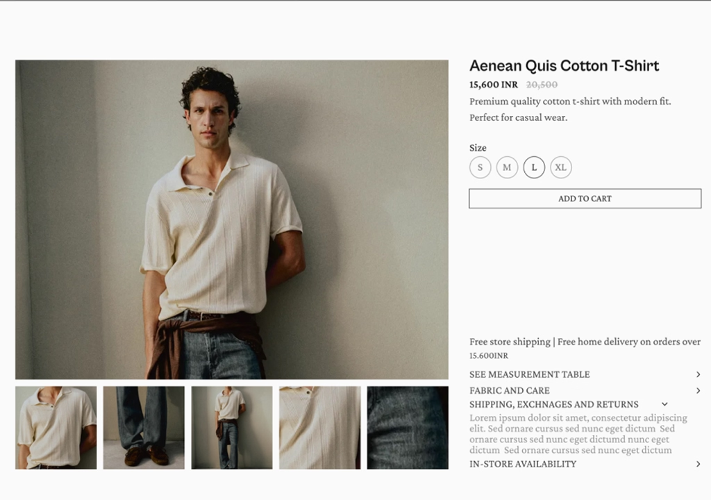
Product Detail
View